 A picture is worth a thousand words, right?
Well, in the world of tsunamis, this picture must be worth about a million.
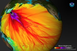
It’s a NOAA Image that shows the highest water surges in the most intense colors. The purples and pinks are near the epicenter off the east coast of Japan.
Three Things To Notice About This March 2011 Japan Tsunami Map
- There’s a very definite highlighted stream of energy leading to northern California. No wonder places like Santa Cruz & Crescent City, California saw damage in and near the shore with lots of boats smashed, etc.
- There’s significantly less energy that made it’s way to Washington and Oregon. That correlates with the relatively low numbers we saw along the Oregon and Washington coasts.
- If you look at the energy around Hawaii, you can see the islands ‘lucked out’ with the most intense tsunami energy traveling just north of the islands. It could’ve been much worse there.

Mr. Susman: You ROCK!!
You totally carried the Koin Local 6 news coverage of the earthquake and tsunami last evening. I continued to watch the local news coverage until about midnight, switching between Channels 12, 8 and 6. YOU had the most accurate and professional coverage of all the weather men. YOU were the first to have a graphic of the wave characteristics and timeline and your explanations were scientific, accurate and understandable to the lay person.
RJ–thanks for the kind words. It was a crazy night with so much information coming from so many different sources. But the second I knew something was accurate Jeff Gianola and I got it on the air. Thanks again for watching! Bruce Sussman